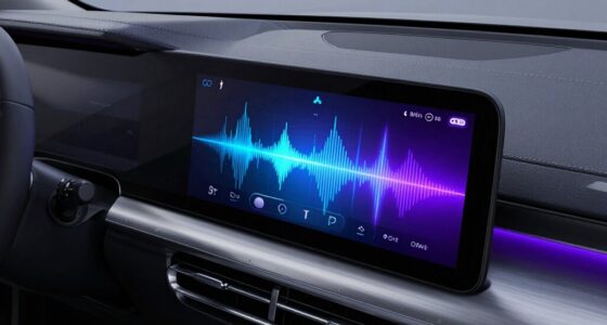
When choosing between big screens and simple dash layouts, you need to balance detailed data visibility with ease of use. Large screens let you display more information at once, helping with complex monitoring, but can become overwhelming if not organized carefully. Simple layouts improve clarity and quick decision-making but may sacrifice depth. The key is finding a setup that suits your environment and goals—if you want to discover how to optimize both, keep exploring.

Get business pricing on garage and car supplies
- Business-only prices and quantity discounts
- Tax-exempt purchasing
- Multiple users, one account, clear invoices
Key Takeaways
- Big screens enable comprehensive data display but risk clutter without careful layout management.
- Simple dashboards improve quick understanding but may lack depth for detailed analysis.
- Larger screens require thoughtful design to balance information density and visual clarity.
- Flexibility and scalability are easier with minimalist layouts suited for various devices and environments.
- The choice depends on whether the priority is in-depth monitoring or rapid decision-making.
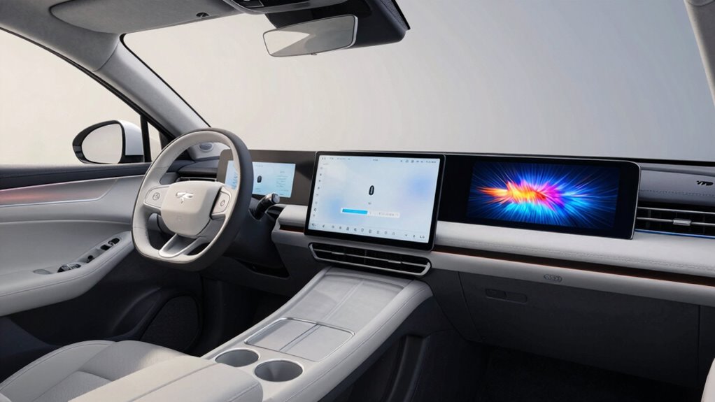
When designing dashboards, choosing between large screens and optimized layouts isn’t just a matter of aesthetics—it directly impacts usability and efficiency. The user interface you create shapes how easily you can interpret data, make decisions, and respond quickly. Larger screens offer a broad canvas, allowing you to display more information simultaneously. This can be especially useful when monitoring multiple data streams or overseeing complex operations. However, simply enlarging the display doesn’t automatically improve data visualization. If the user interface isn’t thoughtfully organized, the extra space can become overwhelming, making it harder to find relevant insights quickly.
Optimized layouts focus on streamlining the user interface, prioritizing clarity and ease of navigation. These layouts often involve fewer, more targeted visual elements, reducing clutter and cognitive load. When you craft a simple dash layout, you’re emphasizing essential data points, making it easier for users to interpret information at a glance. This approach can be particularly effective for quick decision-making and operational responsiveness. While a large screen might tempt you to show everything at once, a well-designed, minimal layout guides the user naturally toward critical metrics without distraction.
The key trade-off lies in balancing the richness of data visualization with the clarity of the user interface. Big screens can display detailed, comprehensive data, but if the design isn’t carefully managed, they risk becoming a jumble of visuals that overwhelm the user. Conversely, a clean, simple layout enhances usability but may sacrifice some depth or context if it doesn’t include enough relevant information. When you opt for a minimalist approach, you need to ensure that the most vital data is front and center, without forcing users to hunt for insights among unnecessary elements. Additionally, visual hierarchy plays a crucial role in guiding the user’s attention effectively across the interface.
Moreover, larger screens demand more thoughtful design considerations. You must account for how users will physically interact with the display—whether they’re sitting at a desk or standing in a control room. This affects font sizes, element spacing, and interaction points. On the other hand, optimized layouts can be more adaptable, easily scaled down or rearranged to fit different devices or user needs without losing clarity or functionality. This flexibility makes them especially valuable in fast-paced environments where quick adjustments are necessary.
Ultimately, the decision hinges on your specific context and goals. If comprehensive monitoring is crucial, a larger screen with layered data visualization might serve you best. If quick interpretation and ease of use are priorities, a streamlined, simple dash layout will likely be more effective. Striking the right balance ensures that your user interface facilitates both detailed analysis and swift decision-making, rather than hindering either. Recognizing the importance of user-centered design can help guide your decision to optimize both usability and functionality.
large monitor for data visualization
As an affiliate, we earn on qualifying purchases.
As an affiliate, we earn on qualifying purchases.
Frequently Asked Questions
How Do User Preferences Influence Screen Size Choices?
Your preferences directly influence screen size choices because user behavior shows whether you prioritize design simplicity or need more information at a glance. If you favor straightforward navigation, smaller screens with simple layouts suit you best. Conversely, if you frequently access complex data, larger screens help you stay organized. Understanding your preferences helps designers create optimized experiences, balancing the need for visual clarity and detailed access based on what users like you find most effective.
What Are the Cost Differences Between Large Screens and Simple Dashboards?
Imagine upgrading from a simple dashboard to a large screen in your control room. The larger screen costs more due to higher hardware expenses, but it improves visual clarity and accommodates more data density, reducing the need for multiple displays. While initial costs are higher, this investment enhances decision-making efficiency. Conversely, simple dashboards are cheaper but might require additional screens, increasing overall costs and potentially compromising data visibility.
How Does Screen Size Impact User Engagement and Retention?
Larger screens can boost user engagement and retention by displaying more information and creating an immersive experience. However, they also introduce visual clutter and readability challenges, making it harder to focus on key data. You might find users overwhelmed or frustrated if the layout isn’t clear. To maintain engagement, balance screen size with a clean, easy-to-read design that minimizes visual clutter and enhances readability.
Are There Specific Industries That Benefit More From Big Screens?
Certain industries, like retail and hospitality, benefit more from big screens because they enhance visibility and engagement. Industry-specific benefits include compelling customer attention and facilitating display customization for promotions or information. You can use large screens to create immersive experiences, making your messaging more impactful. This strategic display choice helps boost sales and customer satisfaction, especially in environments where grabbing attention quickly and clearly displaying information is essential.
What Technological Limitations Affect the Implementation of Large Displays?
You’re limited by hardware constraints and display resolution when implementing large displays. Hardware constraints can restrict the size and processing power needed for seamless performance, while display resolution affects image clarity and detail. If your hardware isn’t capable, large screens may lag or pixelate, undermining their effectiveness. To succeed, you need compatible, high-quality hardware that supports high-resolution displays, ensuring your big screens deliver sharp visuals without performance issues.
As an affiliate, we earn on qualifying purchases.
Conclusion
As you sit behind the wheel, imagine the sleek glow of a big screen lighting up your dashboard, offering all the info at your fingertips. But remember, simplicity keeps your focus on the road, like a clear path through a foggy morning. Balancing these two is like choosing between a vibrant canvas and a calm, open sky. Ultimately, it’s about creating a driving experience that feels both exciting and safe, just like your favorite scenic drive.
As an affiliate, we earn on qualifying purchases.
ergonomic computer monitor stand
As an affiliate, we earn on qualifying purchases.
As an affiliate, we earn on qualifying purchases.
Evergreen bestsellers Picks
bestsellers
As an affiliate, we earn on qualifying purchases.